Color is one of the most powerful tools in a designer's arsenal. It conveys emotion, creates hierarchy, and guides user attention. But color is also complex—what works in light mode might fail in dark mode, and what looks good might be inaccessible. Let's build a color system that's beautiful, functional, and accessible.
Color Theory Fundamentals
Understanding color relationships is essential for creating harmonious interfaces.
The Color Wheel
Complementary colors (opposite on the wheel) create high contrast and energy. Analogous colors (adjacent on the wheel) create harmony and calm. Triadic colors (evenly spaced) create balance and vibrancy. Use these relationships intentionally to create the mood you want.
Color Psychology
Blue conveys trust and calm—perfect for financial and healthcare apps. Red creates urgency and excitement—great for calls-to-action and alerts. Green suggests growth and success—ideal for confirmations and positive states. Orange is friendly and energetic—excellent for creative and social apps. Choose your primary color based on your brand personality and user expectations.
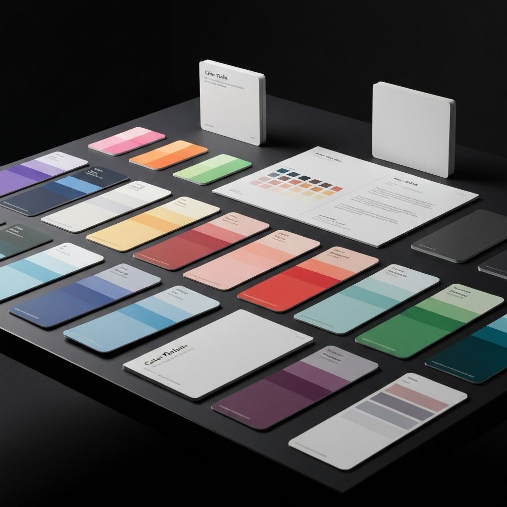
Building a Color System
A systematic approach to color creates consistency and makes design decisions easier.
Semantic Color Tokens
Don't use colors directly in your components. Instead, define semantic tokens: --color-primary, --color-success, --color-error, --color-warning. This creates a layer of abstraction that makes it easy to change colors globally and support themes. Your components reference semantic tokens, not specific colors.
Color Scales
For each color, create a scale from light to dark. A common approach is 50, 100, 200, 300, 400, 500, 600, 700, 800, 900. Use 500 as your base color. Lighter shades for backgrounds and hover states. Darker shades for text and active states. Tools like Tailwind's color palette generator can help create harmonious scales.
Accessibility and Contrast
Beautiful colors mean nothing if users can't read your text.
WCAG Contrast Requirements
WCAG AA requires 4.5:1 contrast for normal text and 3:1 for large text. WCAG AAA requires 7:1 and 4.5:1 respectively. Use tools like WebAIM's contrast checker to verify your combinations. Don't rely on color alone to convey information—use icons, labels, or patterns as well.
Color Blindness Considerations
About 8% of men and 0.5% of women have some form of color blindness. The most common is red-green color blindness. Never use red and green as the only way to distinguish between states. Add icons, patterns, or labels. Test your designs with color blindness simulators.
Key Takeaways
Color is powerful, but it must be used thoughtfully. Build a systematic approach with semantic tokens and scales. Ensure accessibility with proper contrast ratios. Consider color blindness and cultural associations. The result is a color system that's beautiful, functional, and inclusive.
Continue Reading
More expert insights on web design and development

The Psychology of High-Converting Landing Pages
Understanding cognitive biases, visual hierarchy, and persuasion principles that drive user action. A deep dive into the psychological triggers that separate 2% conversion rates from 15%.
Core Web Vitals: The Complete Technical Guide
Master LCP, FID, and CLS optimization with advanced techniques. From image optimization to JavaScript splitting, learn how to achieve perfect Lighthouse scores.

Typography Systems for Digital Products
Building scalable type systems with modular scales, fluid typography, and variable fonts. How to create visual hierarchy that guides users effortlessly.