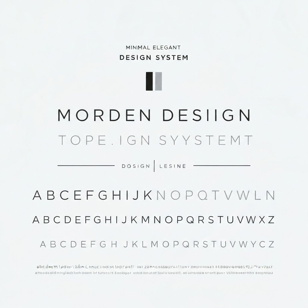
Typography is the foundation of digital design. It's not just about making text look pretty—it's about creating hierarchy, establishing rhythm, and guiding users through your interface. A well-designed type system makes your product feel cohesive, professional, and easy to use. Let's build one from scratch.
Choosing Your Typefaces
The first decision in any type system is choosing your fonts. This isn't about personal preference—it's about function, performance, and brand alignment.
System Fonts vs. Web Fonts
System fonts (like San Francisco on iOS or Segoe UI on Windows) load instantly because they're already on the user's device. They're perfect for body text and UI elements. Web fonts give you brand personality but add loading time. Use them strategically for headings and key brand moments. Consider variable fonts for maximum flexibility with minimal file size.
Pairing Fonts
The classic pairing is a serif for headings and a sans-serif for body text, or vice versa. The key is contrast without conflict. Your fonts should feel different enough to create hierarchy but similar enough to feel cohesive. Test your pairings at different sizes and weights. A pairing that works at large sizes might clash at small sizes.
Performance Considerations
Every font file adds to your page weight. Limit yourself to 2-3 font families maximum. Within each family, only load the weights and styles you actually use. If you only use Regular and Bold, don't load Light, Medium, and Black. Use font-display: swap to prevent invisible text while fonts load.
Building a Modular Scale
A modular scale creates mathematical harmony in your type sizes. Instead of arbitrary sizes, you use a ratio to generate a scale of related sizes.
Choosing Your Ratio
Common ratios include 1.25 (Major Third), 1.333 (Perfect Fourth), 1.5 (Perfect Fifth), and 1.618 (Golden Ratio). Smaller ratios create subtle hierarchy; larger ratios create dramatic contrast. For most digital products, 1.25 to 1.333 works well. Start with a base size (usually 16px for body text) and multiply by your ratio for each step up.
Implementing Your Scale
Define your scale as CSS custom properties or design tokens. For example: --text-xs: 0.75rem, --text-sm: 0.875rem, --text-base: 1rem, --text-lg: 1.25rem, --text-xl: 1.5rem, --text-2xl: 2rem. This creates consistency and makes it easy to adjust your entire scale by changing the base size or ratio.
Fluid Typography
Fluid typography scales smoothly between viewport sizes instead of jumping at breakpoints. This creates a more refined, responsive experience.
The clamp() Function
CSS clamp() lets you set a minimum, preferred, and maximum size: font-size: clamp(1rem, 2vw + 0.5rem, 2rem). This scales the font between 1rem and 2rem based on viewport width. The middle value (2vw + 0.5rem) determines the scaling rate. Use a fluid type scale calculator to generate your values.
Maintaining Readability
As text scales, line length and line height need to adjust too. Longer lines need more line height for readability. Use clamp() for line-height as well: line-height: clamp(1.5, 1.5 + 0.5vw, 2). Aim for 45-75 characters per line for optimal readability.
Creating Visual Hierarchy
Hierarchy guides users through your content. It tells them what's important and what to read first.
Size and Weight
The most obvious hierarchy tool is size. Headings should be noticeably larger than body text. But don't rely on size alone—combine it with weight. A bold heading at a moderate size often works better than a thin heading at a large size. Use weight to create emphasis within the same size class.
Color and Contrast
Primary content should be high contrast (dark text on light background or vice versa). Secondary content can be lower contrast (gray text). Tertiary content even lower. This creates a natural reading order. But always maintain WCAG AA contrast ratios (4.5:1 for body text, 3:1 for large text).
Spacing and Rhythm
Vertical rhythm creates visual harmony. Use consistent spacing between elements. A common approach is to base all spacing on your line height. If your line height is 1.5rem, use multiples of 0.75rem (half) or 1.5rem for spacing. This creates a subtle grid that feels organized even if users don't consciously notice it.
Key Takeaways
A well-designed type system is invisible. Users don't notice it—they just find your product easy to read and navigate. Start with solid foundations: choose appropriate typefaces, build a modular scale, implement fluid sizing, and create clear hierarchy. Document your system so your team can use it consistently. And remember: typography is a tool for communication. Every decision should serve the goal of making your content clear, accessible, and engaging.
Continue Reading
More expert insights on web design and development

The Psychology of High-Converting Landing Pages
Understanding cognitive biases, visual hierarchy, and persuasion principles that drive user action. A deep dive into the psychological triggers that separate 2% conversion rates from 15%.

Core Web Vitals: The Complete Technical Guide
Master LCP, FID, and CLS optimization with advanced techniques. From image optimization to JavaScript splitting, learn how to achieve perfect Lighthouse scores.

Advanced React Patterns for Production Apps
Compound components, render props, custom hooks, and state machines. Architectural patterns that scale from startup to enterprise.

