Landing pages are the digital equivalent of a first impression. In those crucial first seconds, visitors make split-second decisions about whether to stay or leave. Understanding the psychology behind these decisions is the difference between a 2% conversion rate and a 15% one. This isn't about tricks or manipulation—it's about understanding human behavior and designing experiences that naturally guide users toward action.
The Power of Cognitive Biases
Our brains are wired with shortcuts—cognitive biases that help us make quick decisions. Smart landing pages leverage these biases ethically to guide user behavior.
Social Proof: The Herd Mentality
Humans are social creatures. We look to others to validate our decisions. Displaying testimonials, user counts, and trust badges isn't just decoration—it's tapping into our fundamental need for social validation. A study by Nielsen found that 92% of consumers trust recommendations from people they know, and 70% trust online reviews. Your landing page should showcase real results from real people. Include specific numbers, photos, and detailed testimonials that tell a story.
Scarcity and Urgency
When something is scarce, we want it more. This isn't manipulation—it's basic economics and psychology. Limited-time offers, countdown timers, and stock indicators create genuine urgency. But here's the key: it must be real. Fake scarcity destroys trust. Use scarcity when it's authentic—limited spots in a program, seasonal offers, or genuine inventory constraints.
The Anchoring Effect
The first number a visitor sees becomes their reference point. This is why pricing pages often show the most expensive option first, or why 'was $199, now $99' is so effective. The original price anchors expectations, making the discount feel more valuable. Use anchoring strategically in your pricing presentation.
Visual Hierarchy and Eye Tracking
Where users look matters. Eye-tracking studies reveal predictable patterns in how people scan web pages. The F-pattern and Z-pattern are real, and understanding them is crucial for conversion optimization.
The F-Pattern for Text-Heavy Pages
Users read in an F-shaped pattern: horizontally across the top, down the left side, then another horizontal sweep. This means your most important information should be in the top-left quadrant. Your headline, value proposition, and primary CTA should all fall within this natural reading pattern.
The Z-Pattern for Minimal Designs
For pages with less text, users follow a Z-pattern: top-left to top-right, diagonal down to bottom-left, then across to bottom-right. This is perfect for hero sections. Place your logo top-left, navigation top-right, value proposition in the middle, and CTA bottom-right.
Directional Cues
Arrows, lines, and even the gaze of people in photos can direct attention. If you have a photo of a person, have them looking toward your CTA, not away from it. Use subtle arrows or lines to guide the eye toward conversion points.
The Psychology of Color
Color isn't just aesthetic—it's psychological. Different colors trigger different emotional responses and behaviors.
CTA Button Colors
There's no universally 'best' button color, but there are principles. Your CTA should contrast with your page background. If your page is blue, an orange button will stand out. The key is contrast and visibility. Test different colors, but always ensure high contrast ratios for accessibility.
Brand Color Psychology
Blue conveys trust and security (banks love it). Red creates urgency and excitement (perfect for sales). Green suggests growth and health (great for wellness brands). Orange is friendly and energetic (ideal for calls-to-action). Choose colors that align with your brand message and test their impact on conversions.
Copywriting That Converts
Words matter. The difference between 'Sign Up' and 'Get Started' can be thousands of dollars in revenue.
Value-Focused Headlines
Your headline should answer one question: 'What's in it for me?' Don't talk about your company or your features. Talk about the transformation you provide. Instead of 'We offer web design services,' try 'Transform Your Website Into a 24/7 Sales Machine.' The second version focuses on the outcome, not the service.
Benefit-Driven Copy
Features tell, benefits sell. A feature is 'mobile-responsive design.' A benefit is 'your customers can buy from you anywhere, anytime.' Always translate features into benefits. Ask yourself: 'So what?' after every feature statement until you reach the real benefit.
Overcoming Objections
Every visitor has objections: too expensive, not sure it works, don't trust you yet. Address these head-on. Use FAQs, guarantees, and testimonials to overcome common objections before they become deal-breakers.
Key Takeaways
High-converting landing pages aren't about tricks or hacks—they're about understanding human psychology and designing experiences that naturally guide users toward action. By leveraging cognitive biases ethically, creating clear visual hierarchies, using color strategically, and writing benefit-focused copy, you can dramatically increase your conversion rates. Remember: every element on your page should have a purpose. If it doesn't contribute to conversion, it's a distraction. Test everything, measure results, and continuously optimize based on real user behavior.
Continue Reading
More expert insights on web design and development
Core Web Vitals: The Complete Technical Guide
Master LCP, FID, and CLS optimization with advanced techniques. From image optimization to JavaScript splitting, learn how to achieve perfect Lighthouse scores.
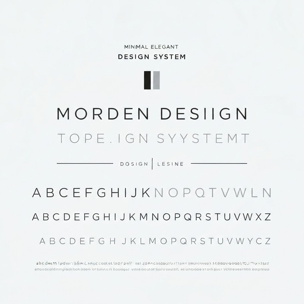
Typography Systems for Digital Products
Building scalable type systems with modular scales, fluid typography, and variable fonts. How to create visual hierarchy that guides users effortlessly.

Advanced React Patterns for Production Apps
Compound components, render props, custom hooks, and state machines. Architectural patterns that scale from startup to enterprise.