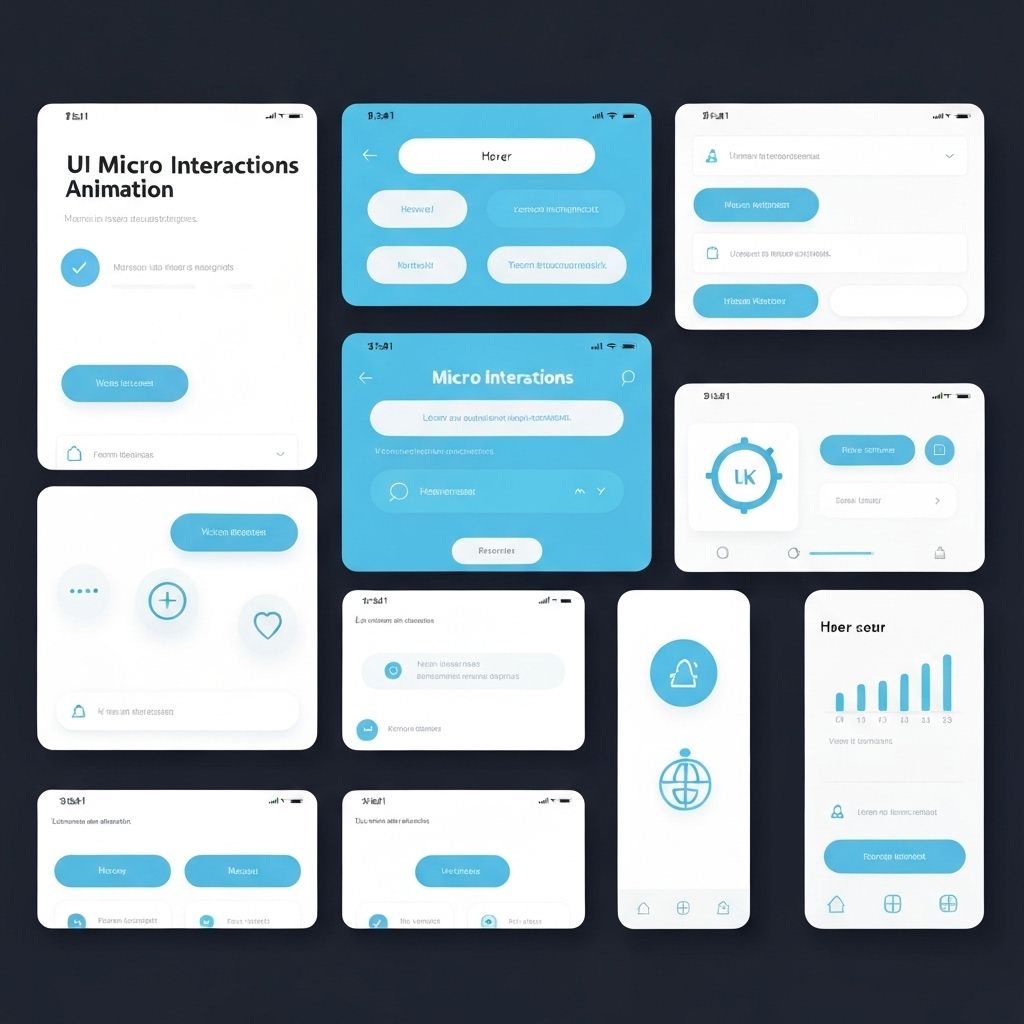
Micro-interactions are the small, functional animations and feedback mechanisms that make digital products feel polished and responsive. They're the difference between a product that feels mechanical and one that feels alive. These tiny details might seem insignificant, but they have an outsized impact on user experience and perceived quality.
What Makes a Good Micro-Interaction
Great micro-interactions follow four key principles: they provide immediate feedback, they're purposeful, they're subtle, and they enhance rather than distract.
Immediate Feedback
When a user clicks a button, they need instant confirmation that their action registered. A button should respond within 100ms—any longer and it feels laggy. Use visual changes like color shifts, scale transforms, or ripple effects. The key is immediacy. Even if the actual operation takes time, acknowledge the user's action instantly.
Purposeful Animation
Every animation should serve a purpose. Loading spinners tell users to wait. Checkmarks confirm success. Shake animations indicate errors. Don't animate just because you can. Ask: does this animation communicate something useful? If not, remove it. Purposeful animations guide users and reduce cognitive load.
Common Micro-Interaction Patterns
Certain patterns have become standard because they work well and users expect them.
Button States
Buttons should have distinct states: default, hover, active, focus, disabled, and loading. Each state should be visually distinct. Hover states show interactivity. Active states provide click feedback. Focus states aid keyboard navigation. Loading states prevent double-clicks and show progress. Disabled states prevent invalid actions.
Form Validation
Validate as users type, not just on submit. Show success states for valid fields—a green checkmark provides positive reinforcement. Show error states immediately for invalid input, but be forgiving. Don't show errors until the user has finished typing (use debouncing). Provide helpful error messages that explain how to fix the problem.
Loading States
Never leave users wondering if something is happening. Use skeleton screens for content that's loading. Use progress bars for operations with known duration. Use spinners for indeterminate waits. For very fast operations (under 300ms), skip the loading state entirely—it's more jarring than helpful.
Implementation Best Practices
Technical considerations for smooth, performant micro-interactions.
Use CSS Transforms
Animate transform and opacity properties—they're GPU-accelerated and don't trigger layout recalculations. Avoid animating width, height, top, left, or margin—these cause expensive reflows. Use transform: scale() instead of changing width/height. Use transform: translate() instead of changing position.
Respect User Preferences
Some users have vestibular disorders or motion sensitivity. Respect the prefers-reduced-motion media query. When this is set, reduce or eliminate animations. You can still provide feedback through color changes or instant state transitions. Accessibility isn't optional—it's essential.
Key Takeaways
Micro-interactions are where good design becomes great design. They're the polish that makes products feel premium and thoughtful. Focus on immediate feedback, purposeful animation, and technical performance. Respect user preferences and accessibility needs. The result is an interface that feels responsive, alive, and delightful to use.
Continue Reading
More expert insights on web design and development
The Psychology of High-Converting Landing Pages
Understanding cognitive biases, visual hierarchy, and persuasion principles that drive user action. A deep dive into the psychological triggers that separate 2% conversion rates from 15%.
Core Web Vitals: The Complete Technical Guide
Master LCP, FID, and CLS optimization with advanced techniques. From image optimization to JavaScript splitting, learn how to achieve perfect Lighthouse scores.
Typography Systems for Digital Products
Building scalable type systems with modular scales, fluid typography, and variable fonts. How to create visual hierarchy that guides users effortlessly.