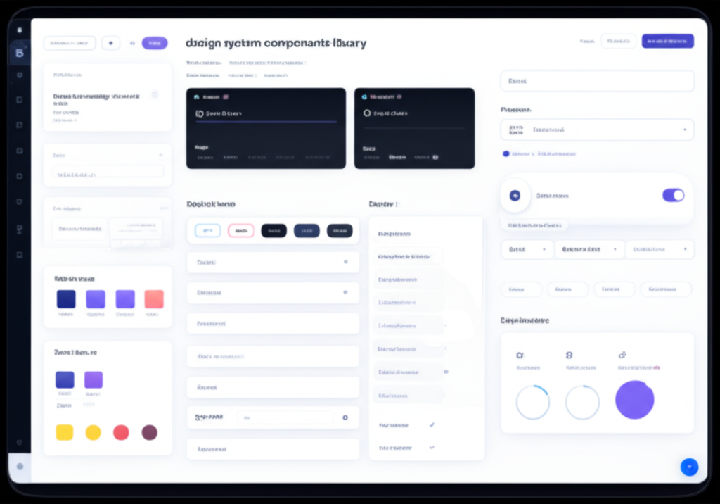
A design system is more than a component library. It's a shared language between designers and developers. It's a set of principles, patterns, and tools that enable teams to build consistent, high-quality products faster. But building a design system that scales requires careful planning and architecture. Let's build one that grows with your organization.
Foundation: Design Tokens
Design tokens are the atomic values of your design system. They're the foundation everything else builds on.
What Are Design Tokens
Design tokens are named entities that store visual design attributes. Instead of using #FF6B35 directly, you use --color-primary. Instead of 16px, you use --space-4. This creates a layer of abstraction that makes it easy to change values globally and support themes. Tokens can represent colors, spacing, typography, shadows, borders, and more.
Token Hierarchy
Organize tokens in tiers. Tier 1: Raw values (--color-orange-500: #FF6B35). Tier 2: Semantic tokens (--color-primary: var(--color-orange-500)). Tier 3: Component tokens (--button-bg: var(--color-primary)). This hierarchy makes it easy to change themes, support dark mode, and maintain consistency.
Token Management
Store tokens in a format that works across platforms. JSON is common. Use tools like Style Dictionary to transform tokens into platform-specific formats: CSS variables, SCSS variables, JavaScript objects, iOS/Android resources. This ensures consistency across web, iOS, Android, and any other platforms.
Component Architecture
Components are the building blocks of your design system. Design them for reuse and composition.
Atomic Design Principles
Organize components by complexity. Atoms: basic elements like buttons, inputs, labels. Molecules: simple combinations like a search field (input + button). Organisms: complex components like headers or cards. Templates: page-level layouts. Pages: specific instances. This hierarchy makes it easy to find and reuse components.
Component API Design
Design component APIs for flexibility without complexity. Use sensible defaults so components work out of the box. Provide props for common variations. Use composition for complex customization. A button should be simple by default but support icons, loading states, and different sizes through props.
Variants and States
Every component should handle all necessary variants and states. Buttons need primary, secondary, and tertiary variants. They need default, hover, active, focus, disabled, and loading states. Document all variants and states. Provide examples of each. This ensures consistent implementation across your product.
Documentation and Adoption
A design system is only valuable if people use it. Documentation and evangelism are crucial.
Component Documentation
Document every component with: description, props/API, variants, states, usage guidelines, accessibility notes, and code examples. Use tools like Storybook to create interactive documentation. Show components in context. Explain when to use each variant. Good documentation makes adoption easy.
Design Principles
Document the principles behind your design system. Why did you make certain decisions? What problems does the system solve? What are the guiding principles? This helps teams make decisions when they encounter situations not covered by existing components. Principles guide creation of new components.
Contribution Guidelines
Make it easy for teams to contribute. Provide clear guidelines for proposing new components, reporting issues, and submitting changes. Use a governance model that balances consistency with flexibility. Regular design system meetings can help coordinate efforts and make decisions.
Maintenance and Evolution
Design systems are never done. They evolve with your product and organization.
Versioning Strategy
Use semantic versioning. Major versions for breaking changes. Minor versions for new features. Patch versions for bug fixes. Provide migration guides for breaking changes. Support multiple versions temporarily to give teams time to upgrade. Clear versioning makes it safe to evolve the system.
Measuring Success
Track adoption metrics: how many teams use the system, how many components are used, how much custom code exists outside the system. Track efficiency metrics: time to build new features, consistency across products, design-to-development handoff time. Use these metrics to demonstrate value and guide improvements.
Key Takeaways
A successful design system requires solid foundations (design tokens), well-architected components, excellent documentation, and ongoing maintenance. Start small with core components and expand based on real needs. Involve both designers and developers from the beginning. Make contribution easy. Measure success and iterate. The result is a system that scales with your organization, enabling teams to build consistent, high-quality products faster.
Continue Reading
More expert insights on web design and development
The Psychology of High-Converting Landing Pages
Understanding cognitive biases, visual hierarchy, and persuasion principles that drive user action. A deep dive into the psychological triggers that separate 2% conversion rates from 15%.
Core Web Vitals: The Complete Technical Guide
Master LCP, FID, and CLS optimization with advanced techniques. From image optimization to JavaScript splitting, learn how to achieve perfect Lighthouse scores.
Typography Systems for Digital Products
Building scalable type systems with modular scales, fluid typography, and variable fonts. How to create visual hierarchy that guides users effortlessly.