The Psychology of Color in Web Design: Choosing the Right Palette
Color is one of the most powerful tools in a web designer's arsenal. It can influence emotions, guide user behavior, and communicate brand values without a single word.
How Colors Affect User Perception
Different colors evoke different emotional responses. Blue conveys trust and reliability, which is why it's commonly used by financial institutions. Red creates urgency and excitement, making it effective for sales and clearance sections.
Color Psychology in Branding
Your color palette is a fundamental aspect of your brand identity. Research shows that color increases brand recognition by up to 80%, and consistent color usage across platforms strengthens brand identity.
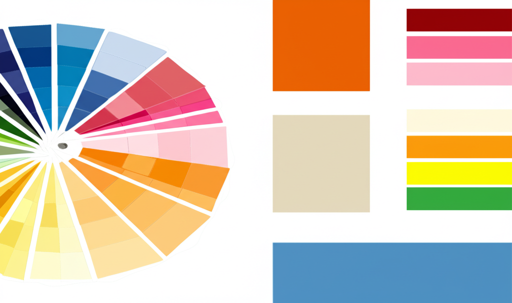
Creating Effective Color Schemes
A well-designed website typically uses:
- A dominant color (60%) - Your primary brand color
- A secondary color (30%) - Complements your primary color
- An accent color (10%) - Used for calls-to-action and highlights
Color Accessibility Considerations
About 8% of men and 0.5% of women have some form of color vision deficiency. Ensuring sufficient color contrast is essential for making your website accessible to all users.
Testing Your Color Choices
A/B testing different color schemes, especially for key elements like buttons and forms, can provide valuable insights into what works best for your specific audience.
About the Author

Alexander Fountain
Founder & Lead Designer
Alexander has over a decade of experience in web design and conversion optimization, helping businesses transform their online presence into powerful sales tools.

Ready to improve your website?
Get a free website audit and discover how to turn your website into a sales-generating machine.
Get Your Free Site Audit