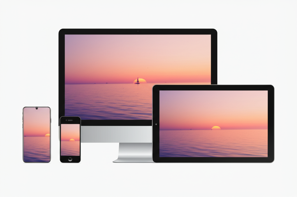
In 2025, designing for mobile isn't just a best practice—it's an absolute necessity. With mobile traffic consistently exceeding desktop traffic and Google's mobile-first indexing, businesses that don't prioritize mobile experiences are at a significant disadvantage.
The Mobile-First Mindset
Mobile-first design means exactly what it sounds like: designing for the smallest screen first, then progressively enhancing the experience for larger screens. This approach forces you to focus on the essential elements of your website and create a streamlined user experience.
Why Mobile-First Matters More Than Ever
- Search Engine Rankings: Google now uses mobile-first indexing, meaning it predominantly uses the mobile version of your site for ranking and indexing.
- User Expectations: Today's users expect seamless experiences across all devices. A poor mobile experience can damage your brand perception.
- Conversion Rates: Mobile conversion rates have been steadily increasing, with some industries seeing mobile conversions surpass desktop.
- Global Accessibility: In many emerging markets, mobile is the primary (or only) way people access the internet.
Key Principles of Effective Mobile Design
1. Content Prioritization - Identify your most important content and make it immediately accessible.
2. Touch-Friendly Interfaces - Design for fingers, not mouse pointers. Buttons should be at least 44×44 pixels and have adequate spacing.
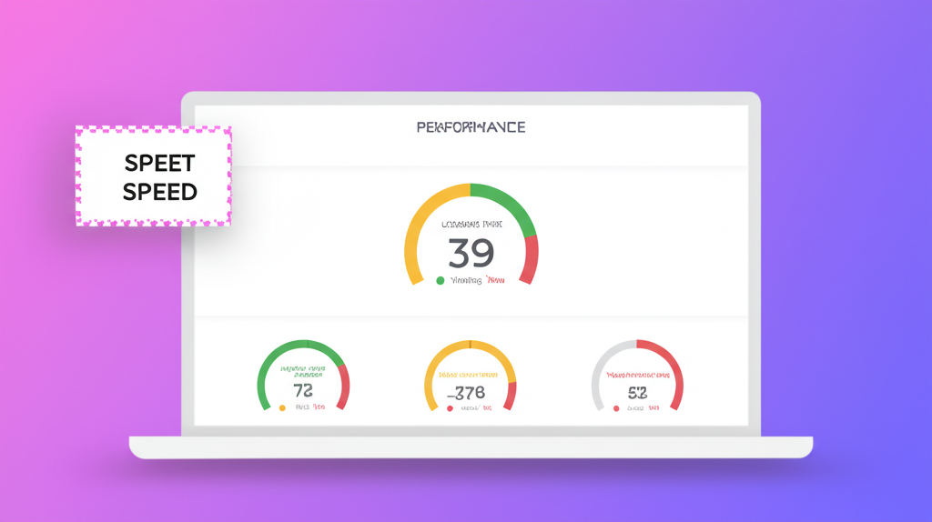
3. Performance Optimization - Mobile users often have slower connections. Every kilobyte matters.
4. Simplified Navigation - Rethink complex navigation structures for smaller screens.
5. Contextual Considerations - Mobile users may have different needs or goals than desktop users.
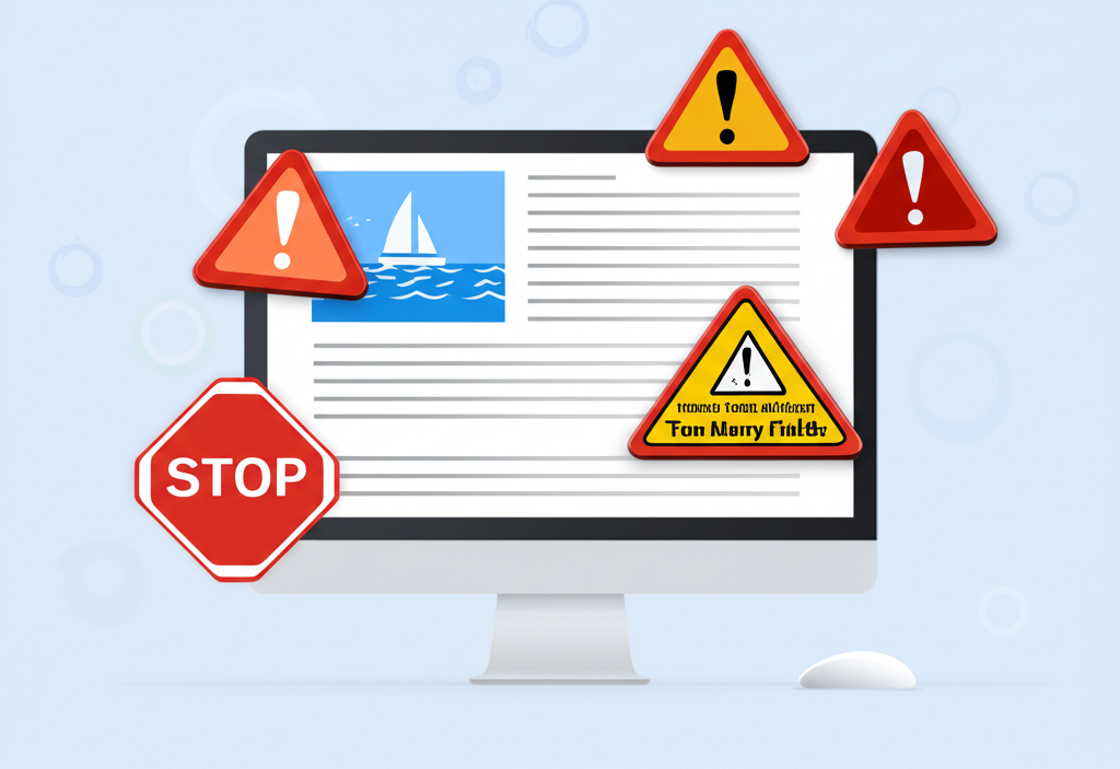
Common Mobile Design Mistakes to Avoid
Even in 2025, many websites still make these critical mobile design errors:
- Tiny text that requires zooming
- Unplayable videos (still using Flash or other non-mobile-friendly formats)
- Interstitial popups that Google penalizes
- Horizontal scrolling due to fixed-width elements
- Touch targets that are too small or too close together
About the Author

Alexander Fountain
Founder & Lead Designer
Alexander has over a decade of experience in web design and conversion optimization, helping businesses transform their online presence into powerful sales tools.

Ready to improve your website?
Get a free website audit and discover how to turn your website into a sales-generating machine.
Get Your Free Site Audit